VISUAL VIBES
Flowing with Marine
Website Branding
BY EMILY HAZEL OF THE FEMPIRE FORMULA™
BRAND FONTS
TITLE Font
Heading Two
HEADING THREE
Heading 4
Paragraph Font
Paragraph 2 BOLD
Paragraph 3
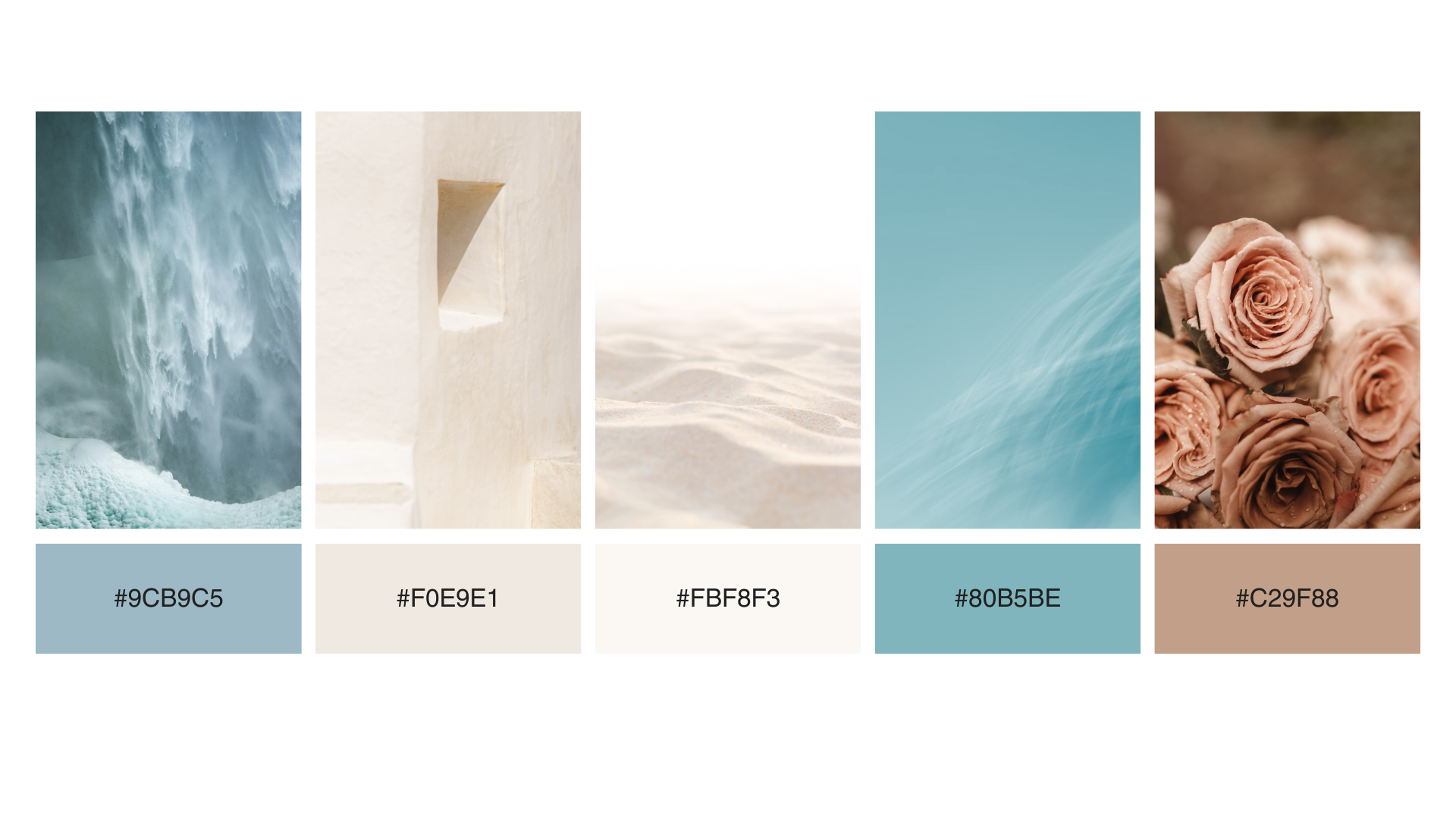
COLOR PALETTE
BUTTONS
Highlighted Text 1
Highlight Example 2

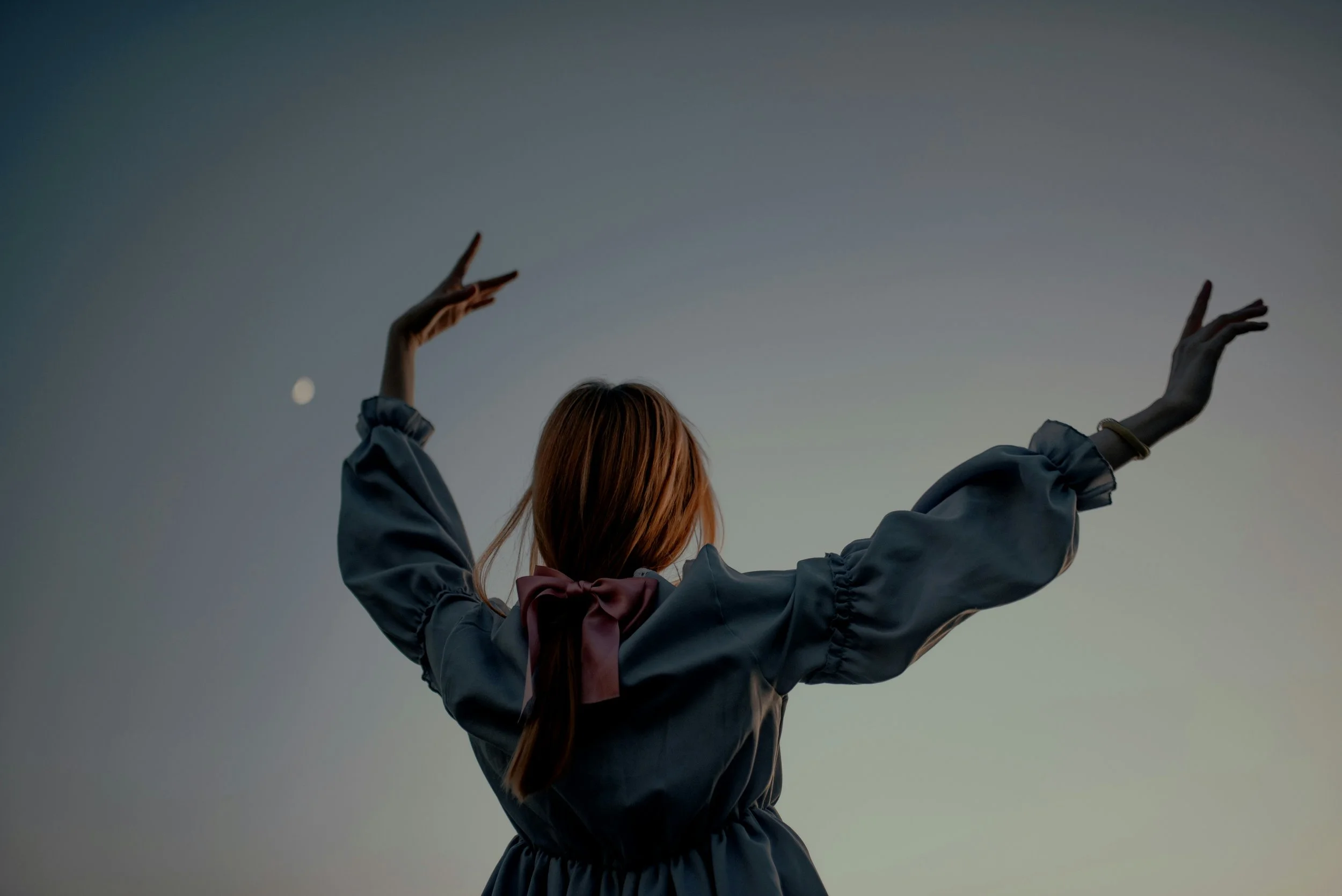
The online home of Flowing with Marine softens our edges, fills our lungs with freshness and breathes us back into a state of peace.
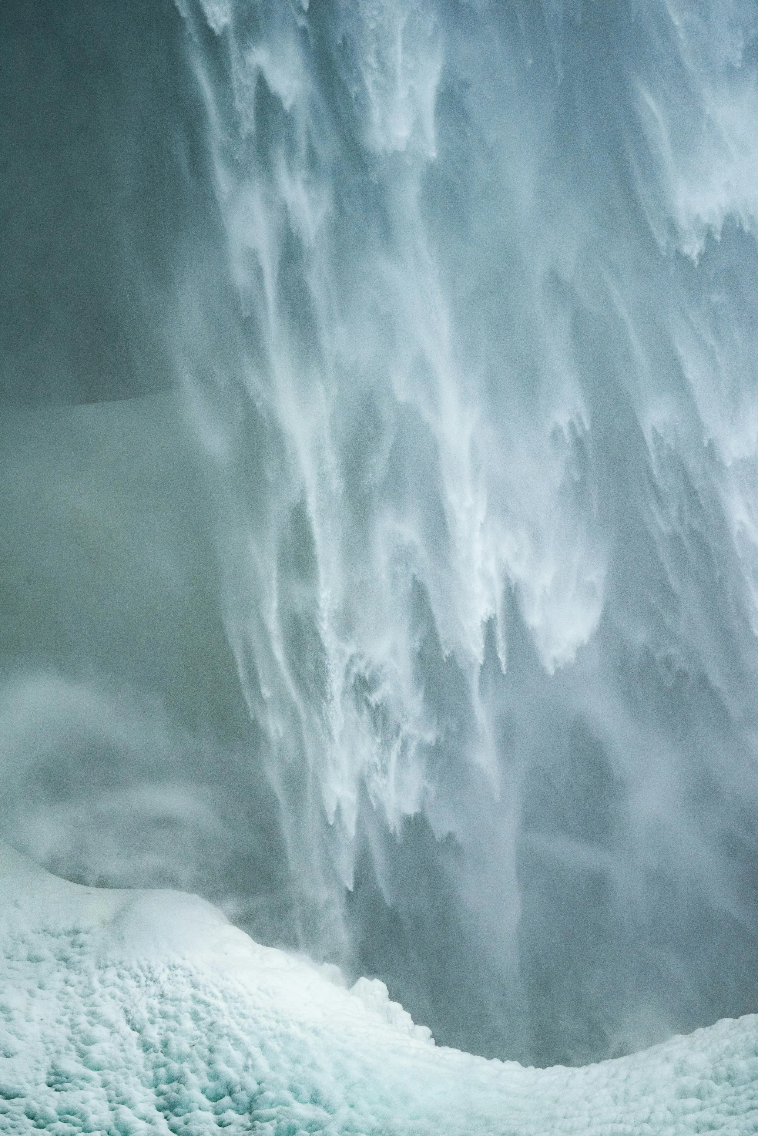
With the archetypal expression of water throughout imagery used, there is flow here, much like the sensation experienced after a session with Marine.
The site design is intentionally simple and optimised for intuitive use for even the most stuck and confused potential client to find relief and solace in securing their sessions.
There is also an allure of mystery, as the simplicity of copy and design does not over explain, but stands with confidence and conviction in the high quality of service, value and transformation it provides.
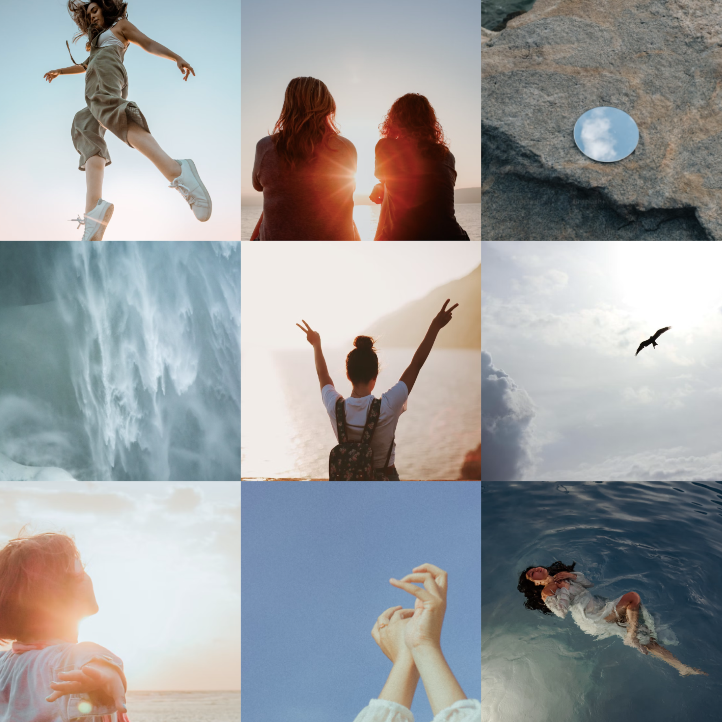
VISUAL MOOD + IMAGERY INSPIRATION
BRAND GOALS
Get energetically clear so you can keep life flowing
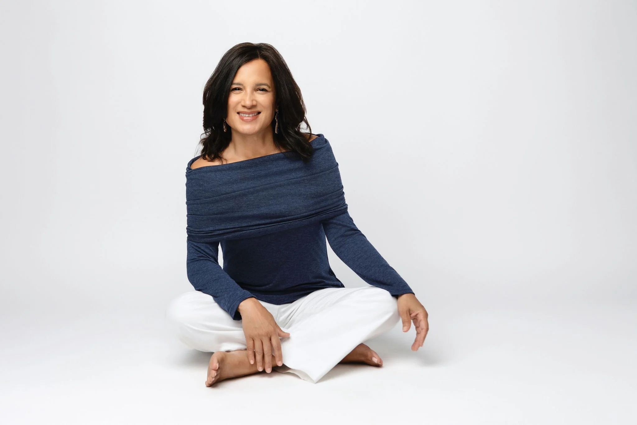
Marine is an experienced and gifted energy healer helping people break free from energetic holdings through her comprehensive sessions.
Flowing With Marine approaches energy blockages holistically and aims to restore peace, grounding and clarity, along with other incredible benefits.
SIMPLICITY • CLARITY • CONNECTION
Emotional Associations & Colour Psychology
“Her power is like water in a mountain stream softening the hardened edges of stone.”
Flowing with Marine is a brand devoted to simplicity and effectively communicating with speed and ease that freeing up your energy is possible now.
As Marine is incredibly experienced, with over a decade in this realm of work and a wealth of knowledge, it was important to position her as an authority quickly.
The colour palette is intentionally selected to reflect the elements of water and light, creating a virtual breath of fresh air to the potentially stressed and overwhelmed visitor, converting them in to a booking client by welcoming them into a safe, calm digital sanctuary that soothes their system.
Blue is often associated with professionalism, reliability and trust, communicating a loyalty and dependability on Marines ability to hold her clients with integrity, care and expertise.
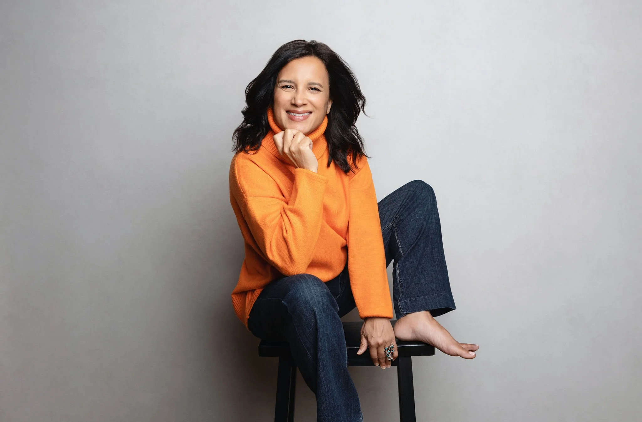
Sandy neutrals acts as an earthy undercurrent to bring grounding to the emotional quality that is implied through the service descriptions, and the pop of orange in imagery exudes joy, energy, higher vibration and hope — all emotional results this brand stands to hold as possible for the brave who book.